The Voice.
Type that has something to say.
An exploration of how typography shapes tone, emotion, and meaning. The Voice treats letters as expressive visual material, giving the message a presence of its own.
- Context
- Type-led design exploration
- Contribution
- Typography, visual hierarchy, layout
- Deliverables
- Typographic studies and identity applications
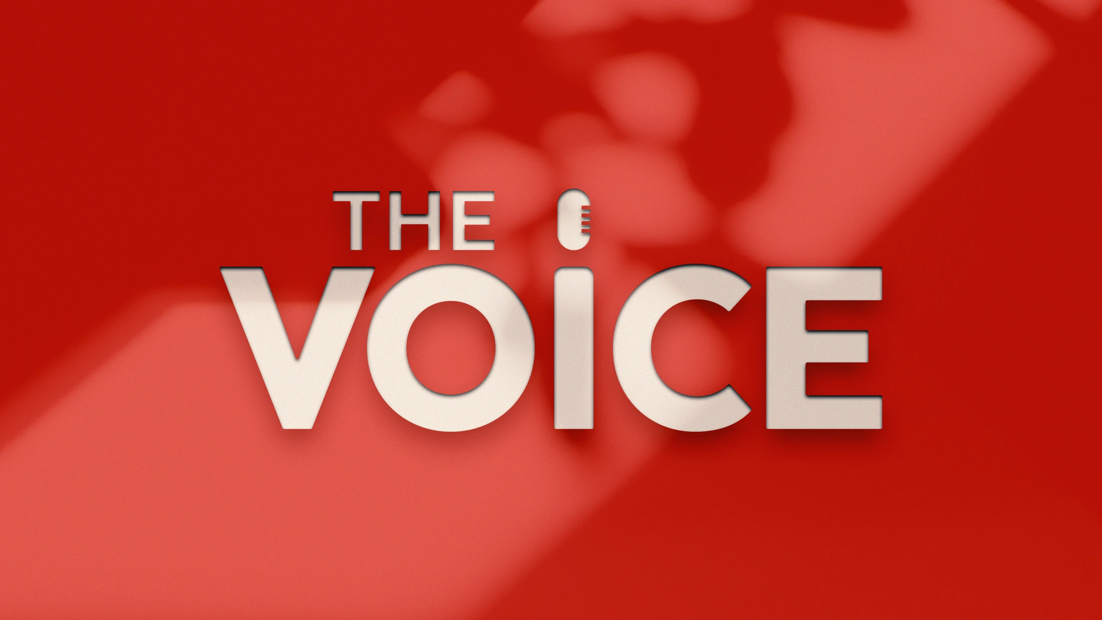
The exploration
Explore how typography can convey tone and presence. The work uses the name The Voice as a starting point for a visual language built around words.
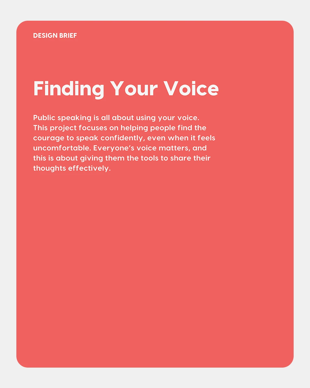
The decision
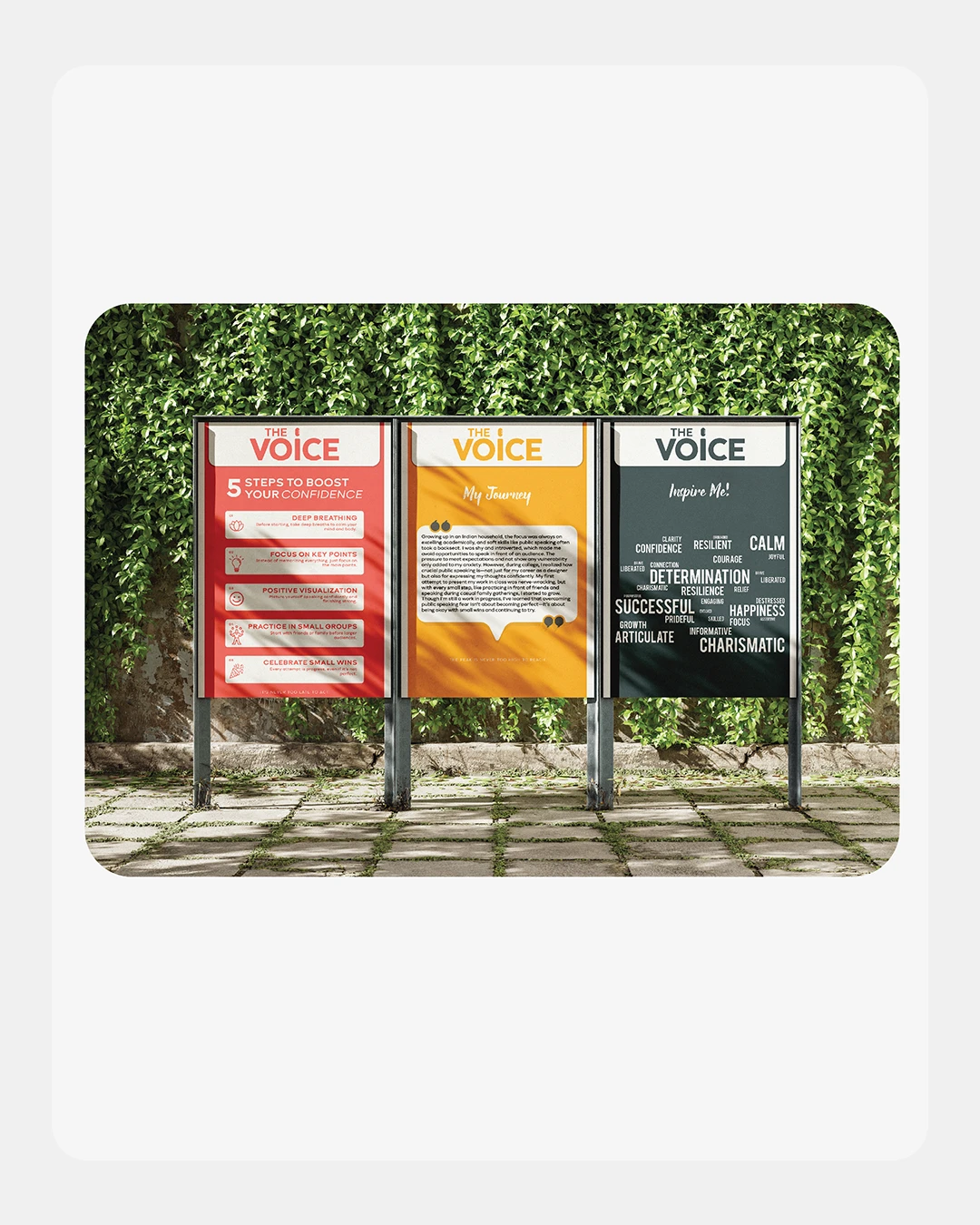
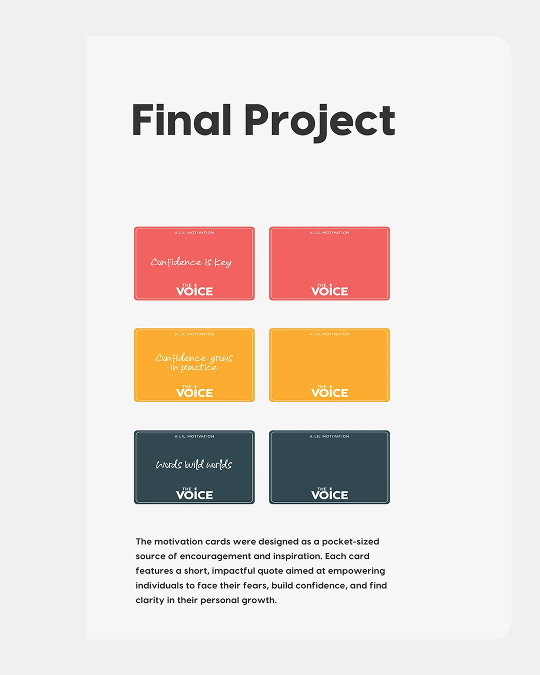
Large lettering establishes the main message, while contrasting type sizes organize supporting information. The application studies test how the identity reads across different compositions.
HAVE A PROJECT OR ROLE IN MIND?
Email Karan ↗All selected work ↗Let’s talk about it.
BAPS Summer Day Camp ↗